As I had a very positive feedback on the german version of this post, I thought about translating, updating and expanding the part on chart analysis in EVE. The first two parts I will simply elaborate the informations that are available ingame, their usage and some history. In the third part, you will find some techniques I use / used with third party – tools and excel.
__________________________________________________________________
EVE is also called “Excel in space”. The reason for that is obvious, because you encounter tables in every single aspect in the game, be it mining, trading, production, PvE or PvP. A newbro rarely gets a grasp on these tables or what they might tell him – it needs a bit of learning and thinking about what he has on the screen, after which he can use this information.
Getting informations from the graph ingame itself is not always easy, but concluding the correct informations is even harder and most the time a bit of an issue of instinct, which comes with time and experience. At first some words on the graphs itself: it shows the market data of one year of the most famous item of EVE: the PLEX or the “pilot licence” for capsuleers. Recently, this item suffered from a spike upwards, as… well, there are many theories and countertheories out there – it is up to you, which one you believe.

This graph however contains several informations: the traded volume per day, the moving average in 5 & 20 days, the median day price and the donchian channel.
1.) Volume traded
The amount of units traded every day is shown at the bottom of the diagram. This information alone is of little use, as it alone can only be an indicator of a stronger or weaker demand and therefore rising or sinking prices. For a more distinguished picture, we need to take into account one more information which is not shown in the diagram, but in the table alone: the amount of orders under the “table”-view of the diagram.
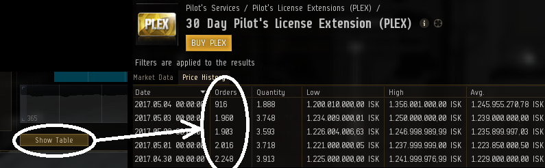
You can – in theory – get the amount of orders (which is a bit misleading, as it is more the “amount of transactions done today” and not “amount of orders currently on the market”) and calculate an “average amount of items sold/bought per order”. I said “in theory”, because this number is only of little use, as long as you do not get data dumps every hour or so. If you do this, it might be possible to locate regular rush-hours for this specific product.
2.) Moving average
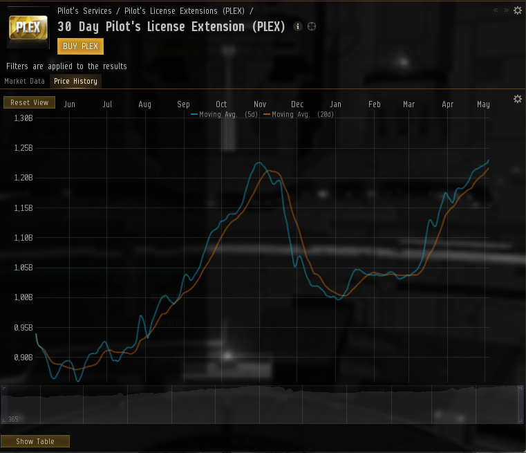 The moving average is nothing more than the information about the unweighted mean over the last 5 (blue) and 20 days (orange). This means, that the price of all orders of the last 5 or 20 days will be added up and then divided by 5 or 20 – simple and easy, just as we all (hopefully) learned in school. This means, that the orange line with the mean of the 20 days will react way slower to changes in price than its counterpart. The picture shows this pretty good: the blue line always reacts faster than the orange one. If both of these graphs rise up, it can mean 2 things: that the demand is higher than usual or that the supply is lower than usual. Which one of these situations is correct does not really matter in EVE, but the consequence is the same. Either you start to produce the good now, speculate the on that the price is rising even further or do whatever you like to do with this information.
3.) Median day price
The median day price is a simple information, but other than the concept of the moving average, the foundation of the median is not always taught in every school. And also we need to keep in mind that not everyone in EVE attended school recently or is working with mathematical formulas in his everyday life. In our diagram, the median day price is shown as small orange dots which are not connected with each other. 
Anyways, the median day price is easily explained with a simple example. So let´s imagine that I have 7 Kestrels (a small caldari frigate) and sell one of them each day of the week at the following prices:
Monday: 1 million
Tuesday: 2 million
Wednesday: 3 million
Thursday: 2.5 million
Friday: 1.5 million
Saturday: 1 million
Sunday: 170 million (as a customer accidently forgot the komma)
While the average take the sum of all these sales divided by the amount of the results, the median is somewhat of the “middle” of all sorted transactions. The average price would be totally messed up by the one las tlucky transaction, meaning that we sold our Kestrel for an average price of (1+2+3+2,5+1,5+1+170)/7 = 25,86 million ISK. Obviously, this information is not useable.
You will see that the median on the other hand is quite robust against such exceptions. To see this, we need to sort the amount of data, beginning with the smallest number: 1, 1, 1.5, 2, 2.5, 3, 170. The median is the exact center of this numerical sequence: 1, 1, 1.5, 2, 2.5, 3.0, 17. So this means that the median of the same data is far more realistic than the average of about 25 million. Thats the way the median price works – but not on a weekly basis but on a daily one. It is easy to say that the median day price is one of the most hardest one to significantly manipulate as a single player.
The last two informations “donchian channel” and “min/max” will be the toppics of the next entry.
Fly dangerous o7.
